Overview
I was mainly in charge of visualization in Spatial. I built from 0 to 1 in the design system, taking on the components that are in charge of the product's main visual identity: logos, typos, and buttons.
Spatial is a platform that allows non-tech users to build and share virtual experience. It primarily serves as a SaaS tool for enterprise teams or as a creation tool for Devs. I added detailed specs to the components for better communication with the ENGs in the team.
Role
Team
3 Designers
4 Devs
Timeline
Background
For more consistent experience,
more efficient communication with devs.
The experience and screen of various cases have increased as products grow in size. In response, we created a design system with designers to have a consistent experience and collaborate more efficiently with developers.
What I value here
The design system was built
on four foundational principles.

Token Structure
Tokens were structured into primitive + semantic layers
to improve consistency, scalability, and communication.
Tokenized colors increase productivity as they are scalable and systematically consistent. Each element has a accessible name, making communication with designers and devs much smoother.
I picked high saturated colors to express exciting and gamified experience, while conveying a variety of experiences created by creators and enterprises.
Structure

Primitive Color Token
Base Color

Grayscale

primitive
to semantic
Semantic Color Token

semantic
to component
Token to Component
Components reference semantic tokens instead of raw values, enabling consistent updates across the system.

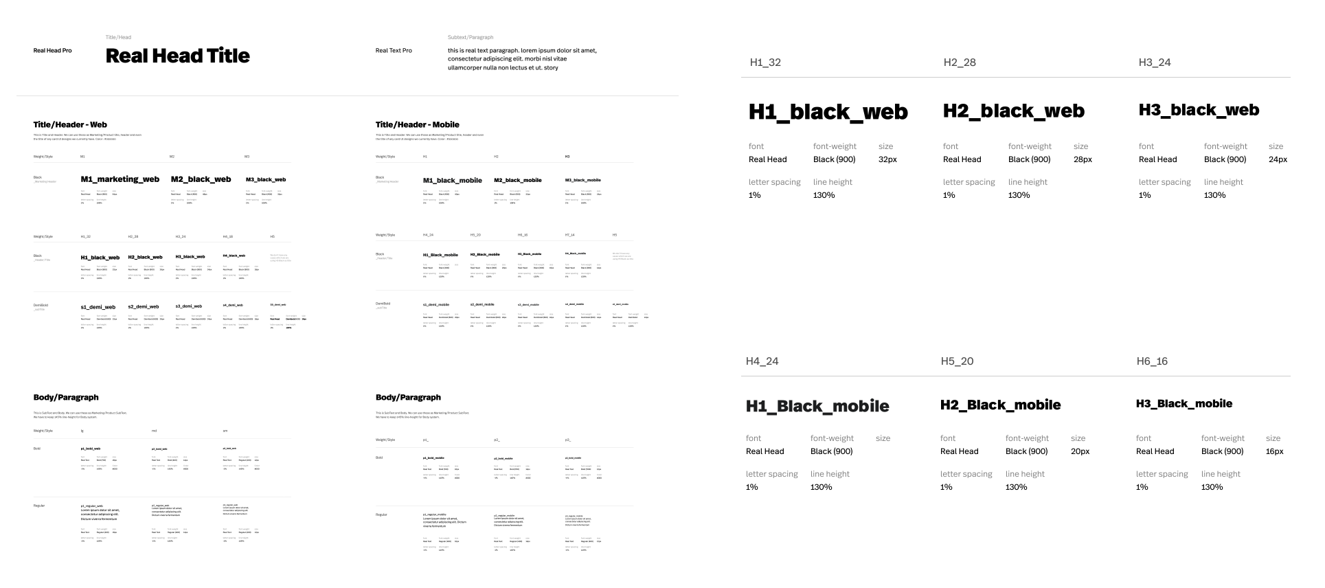
Typo
Documented specs for better communication with devs.
Bold and round characters for playful and accesilibility.
Bold fonts make the product energetic and improve the legibility, and naturally reveal the dynamic feeling to gamified experience. A moderate round makes the product friendlier and more accessible. It conveys "not difficult" for creators and delivers an unduly casual sense of balance to enterprise users.
Below each types, I added detailed specs of the font. This exposes basic font data to the surface, making it easier for engineers in the team to understand the typo system.